Photographics: Applied Color
March 27, 2009 by Jamie
For our second assignment in our class LaNoue had us do applied color. Applied color or hand coloring is where you take a black & white print and color over it with colored pencils, water colors, oils or pastels. In theory, this assignment can be really fun because it brings you back to the days of childhood and coloring books. However, it’s way harder than it looks, at least that is what we found. We chose to color our prints with water color pencils. We used fiber based prints that we had created in our previous zone systems class and for a few hours we hunched over our prints and colored away.
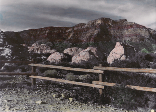
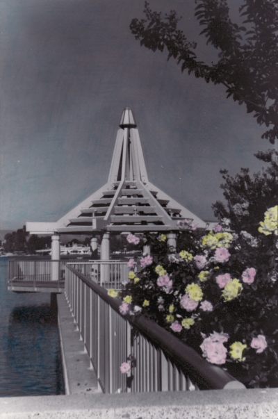
The thing with water color pencils is that they produce more saturated colors than pastels. Having this in mind I put very light layers of color on my prints, however when I finally applied the water to the color via Q-tip I was surprised to see my color all but disappear. I added another layer of color and instead of wiping the Q-tip across I gently blotted it to get the effect I was looking for. My first print of Red Rock Canyon was pretty easy however, my second print turned out to be more frustrating. My second print of North Lake had a lot sky in the photo which I tried to color blue but I could never get it to blend properly which is why it looks uneven. I still like the pink and yellow flowers in the foreground which I think made the print effective.

Red Rock Canyon by Jamie

North Lake by Jamie
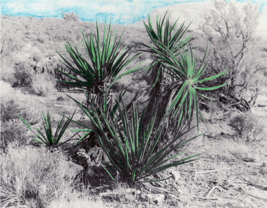
Bryan also had a hard time with his print of the bush. It took him a long time to color because he chose to fill in every single leaf. He also put the color down darker with the pencil and then only slightly blended it with the water which made the leaves really pop out of the print. He then decided to color in the sky by using a technique that LaNoue suggested which was to wet the photo paper first and then add in the color. This made the blues in the sky very saturated, almost like an ocean. He worked into the night to correct for the over saturation. Still after seeing the finished product I think his print is an excellent example of applied color.

Desert by Bryan


Comments
Feel free to leave a comment...
and oh, if you want a pic to show with your comment, go get a gravatar!
You must be logged in to post a comment.