Photographics: Applied Color

March 27, 2009
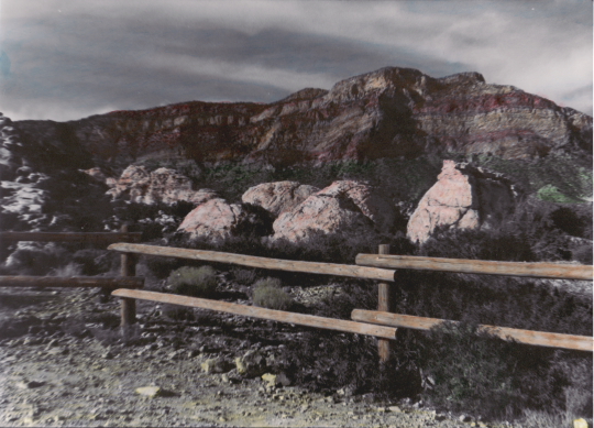
For our second assignment in our class LaNoue had us do applied color. Applied color or hand coloring is where you take a black & white print and color over it with colored pencils, water colors, oils or pastels. In theory, this assignment can be really fun because it brings you back to the days of childhood and coloring books. However, it’s way harder than it looks, at least that is what we found. We chose to color our prints with water color pencils. We used fiber based prints that we had created in our previous zone systems class and for a few hours we hunched over our prints and colored away.   
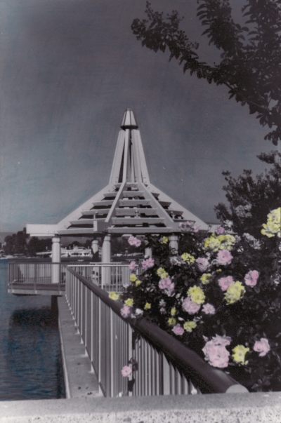
The thing with water color pencils is that they produce more saturated colors than pastels. Having this in mind I put very light layers of color on my prints, however when I finally applied the water to the color via Q-tip I was surprised to see my color all but disappear. I added another layer of color and instead of wiping the Q-tip across I gently blotted it to get the effect I was looking for. My first print of Red Rock Canyon was pretty easy however, my second print turned out to be more frustrating. My second print of North Lake had a lot sky in the photo which I tried to color blue but I could never get it to blend properly which is why it looks uneven. I still like the pink and yellow flowers in the foreground which I think made the print effective. 
Red Rock Canyon by Jamie

Red Rock Canyon by Jamie

North Lake by Jamie
North Lake by Jamie

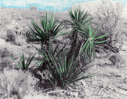
Bryan also had a hard time with his print of the bush. It took him a long time to color because he chose to fill in every single leaf. He also put the color down darker with the pencil and then only slightly blended it with the water which made the leaves really pop out of the print. He then decided to color in the sky by using a technique that LaNoue suggested which was to wet the photo paper first and then add in the color. This made the blues in the sky very saturated, almost like an ocean. He worked into the night to correct for the over saturation. Still after seeing the finished product I think his print is an excellent example of applied color.
Desert by Bryan

Desert by Bryan

Picture of the Week 3-25-2009

March 25, 2009

This week’s picture is something I took today while driving around Irvine. I parked my car on a side street and walked over to South Lake. This shot was one of the first things I saw when I walked up to the lake. I really like how the trees frame the bridge and Mt. Baldy in the background. I also love this lake, I wish I could be one of the lucky residents who gets to reside around it. It’s a beautiful community and makes for great pictures.
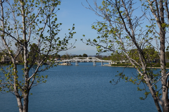
southlake001

Photo Info: Shot with our 5D Mark II, ISO 160, F8 at 1/640 of a second.

Irvine Regional Park

March 23, 2009

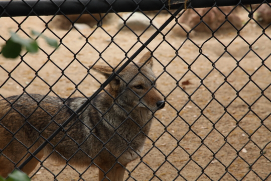
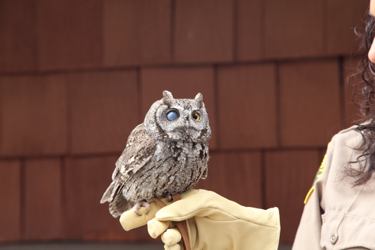
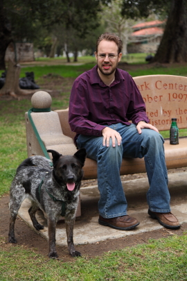
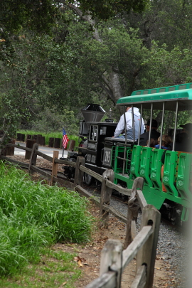
This past Saturday we decided to go out and enjoy the cooler weather at Irvine Regional Park. Bryan’s mom and siblings came down from their place up in the mountains to join us for a picnic. Irvine Regional is a very large park with lots of stuff to do. There are many trails for hiking, mountain biking or horseback riding and there is also a lake where you can rent paddle boats. The park also has a nature center, a train and even a small zoo. After we ate our lunch near the lake we all went to the zoo. As I said before, the zoo is very small but it’s animals include a couple bears, coyotes and even mountain lions. We also saw an owl that was blind in one eye, it was kind of creepy looking but still very cute. After the zoo we headed over to the entrance of the park to ride the train. Luckily they allowed dogs on the train so Bryan’s mom’s dog Mimi got to ride with us. The train goes around a very small area of the park but it is a lot of fun. After our train ride Bryan’s little sister went on a pony ride, that’s right they have pony rides too, and she had a blast. After that we called it a day and headed home but we all had a great time at the park.  
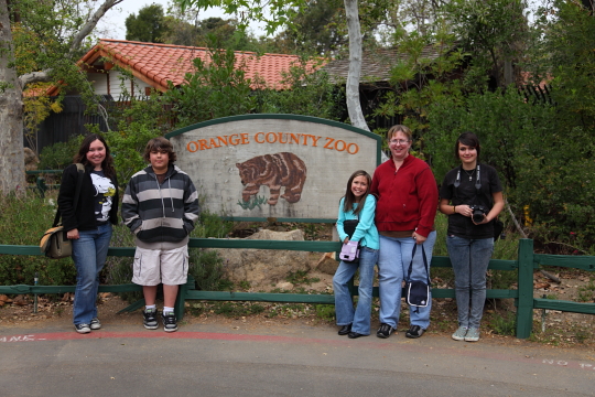
irp001

irp002

irp003

irp004

irp005irp006


Photographics: Toning

March 21, 2009

For our first assignment in our Photographics class we were required to do toning. There are many different kinds of toning and and many different ways to do toning. Our professor Michael Lanoue showed us how to do sepia toning, split toning and selenium toning both in the darkroom and in Photoshop

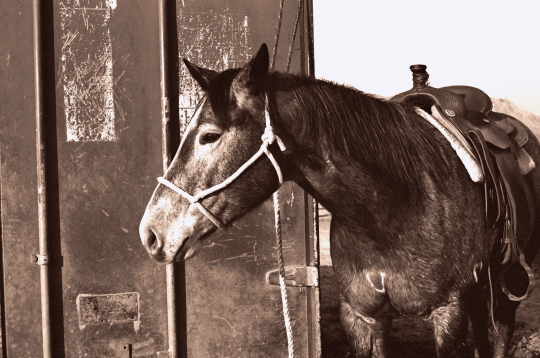
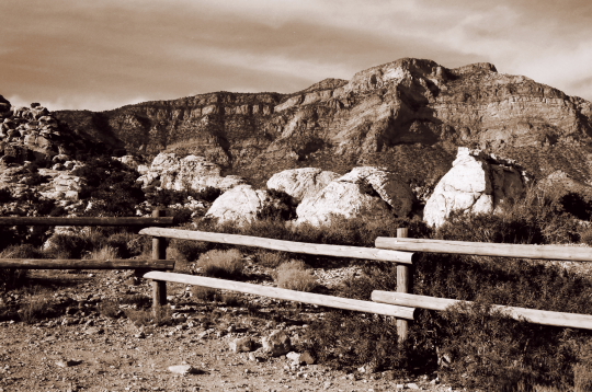
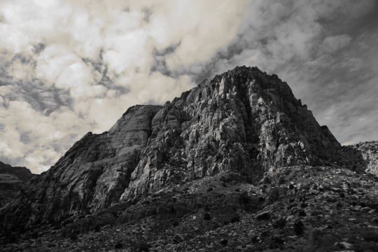
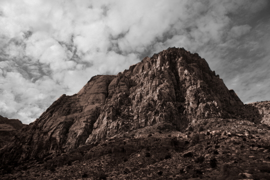
For sepia toning in the darkroom you first must take a print and soak it in water so the photo paper will be receptive to the toning chemicals. You then put the photograph in a bleach solution, this is not household bleach, it’s a bleach specially formulated for photo paper. This lightens the photo and make the highlights look more high contrast. After you wash it again to get off all the bleach solution then put it in the sepia toner. Sepia toning turns the print a brownish hue and I noticed that prints made in the darkroom as opposed to digitally have a more chocolate-brown look to them. After the sepia toning you wash, then fix and then wash a final time. Sepia toning in Photoshop is much easier, you just desaturate the image and then tone it. You can adjust the hue of the tone by using any number of methods including levels, curves and colorizing. I chose to do sepia toned digital prints which I’ve shown below. Both photos were shot with film but I worked on them in GIMP (the cheap person’s Photoshop) to get the sepia tone effect. 
Digital sepia toning by Jamie

Digital sepia toning by Jamie
Digital sepia toning by Jamie

Digital sepia toning by Jamie

Split toning and selective toning is where you have two different tones in the photograph such as black & white and sepia. The way you selective tone in the darkroom is very interesting. You first take a black & white photograph and paint over the areas that you don’t want to be toned with a removable liquid mask solution. Then you follow the same steps as in sepia toning; soak in water, bleach, wash, sepia tone, wash, fix and wash again. You then remove the liquid mask solution you painted over the photograph and you see that it prevented those areas from toning. So you have a black & white and sepia toned image. To get the same effect in Photoshop you would simply mask the areas you wanted to tone. Bryan chose to do split and selective toning with some digital images in GIMP. Even though the first image appears to be in color, the sky is actually black & white and the mountain is sepia. He did this by creating a layer mask.
Digital split toning by Bryan

Digital selective toning by Bryan

Digital selective toning by Bryan

Digital split toning by Bryan

Bryan and I chose not to do this assignment in the darkroom because of time constraints. In order for the prints to be more archival you must use fiber-based photo paper which has a longer wash time. Even though our prints didn’t have the same chocolaty brown tint of the darkroom prints we did manage to get a nice brown hue to them which I believe made them look even better.

Picture of the Week 3-19-2009

March 19, 2009

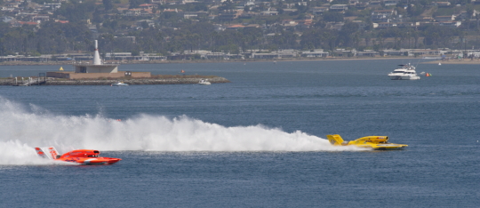
I’ve been feeling a bit uninspired this week so I haven’t photographed anything new. I decided to go back into our photo archives to get this week’s picture. The picture below is of the Thunder Boat races in 2006. The Thunder Boat races take place every year around September at Mission Bay in San Diego. We haven’t been to the races since this picture was taken but they are usually very entertaining so we hope to go back again to take even more awesome photos.
_mg_6048

Photo Info: Taken with a Canon Rebel XT with a 70-200mm lens. Focal length 200mm, ISO 100, F8 at 1/640 of a second.

World Famous Lipizzaner Stallions!

March 15, 2009

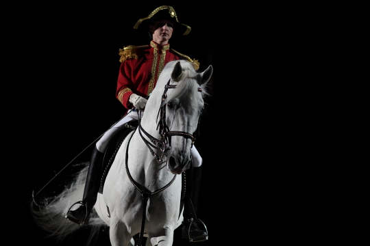
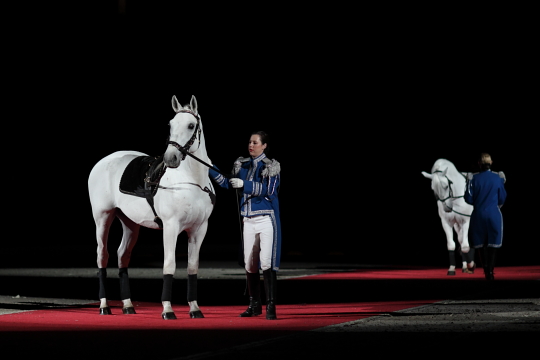
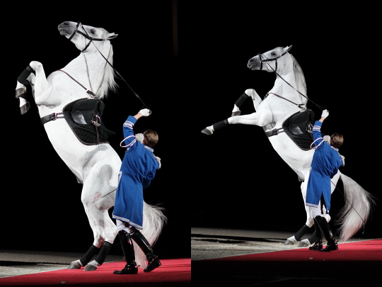
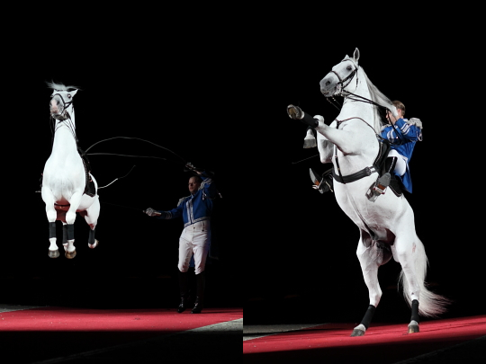
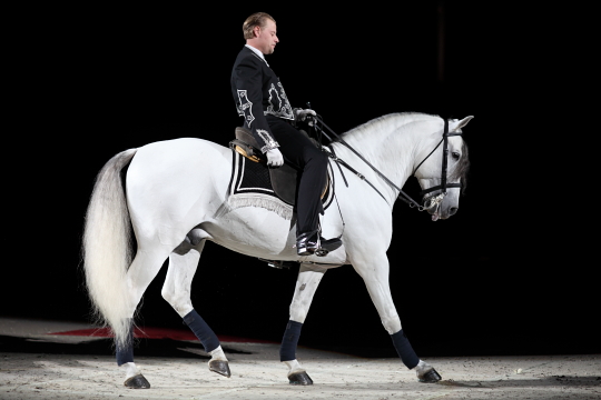
Yesterday we got the privilege to go see the The World Famous Lipizzaner Stallions in Ontario. I have been a fan of the Lipizzaners for a long time but had never seen them perform in real life. Lipizzaners have a very rich history which includes almost being wiped out during bombing raids in World War II. For more on the history of the Lipizzanners check out this page. These horses are highly trained in dressage and also more difficult dressage moves called “airs above the ground” which the Lipizzan breed is famous for. During the show we got to see these stallions do many different dressage styles including performing solo and as groups of three, four and even eight in a synchronized ballet. The most exciting part of the show was when the stallions performed their “airs”. Each stallion was only trained in one or two “airs” which the announcer explained came very naturally to these horses who were only trained to perfect their natural talents. The “airs” that we saw included the levade, courbette, capriole, and the mezair. They also brought out a Andalusian stallion and did a dressage performance set to Spanish music to pay homage to the heritage of the Lipizzaner. One of the many interesting facts that we learned at the show was that while many of the stallions were bred in Austria a few were rescued from a Lipizzan farm in America. We loved seeing these horses in action and you could tell that these stallions loved to show off.
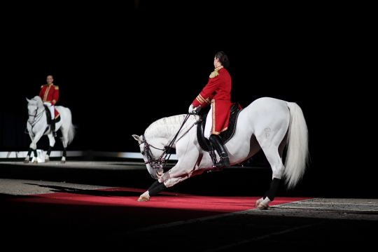
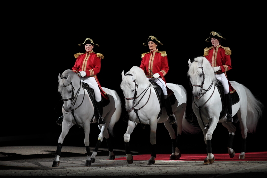
Here are a few pictures from the show and also see more in the GALLERY:
lippizanblog001

 
lippizanblog002

lippizanblog003

lippizanblog004

Mezair

Mezair

Left: Capriole Right: Mezair on horseback
Left: Capriole Right: Mezair on horseback

Andalusian Stallion

Andalusian Stallion

Next Page »