Photographics: Lumen Prints
May 29, 2009
For one of our class projects we were required to do lumen prints. Lumen prints are very simple to do and the end result is very cool. To do a lumen print you first take a piece of photo paper, fiber or RC, out in direct sunlight and then proceed to put objects on the paper to create a design. Depending on the amount of sunlight available you would leave these pieces of photo paper out for a few hours. The minimum would be about three hours but some of our fellow students left them out for up eight hours. After waiting you would then take your exposed photo paper and put it straight into the fixer and watch your image appear. For our lumen prints we used cold toned, glossy RC paper. We used Bryan’s grandparents backyard along with a few of their garden plants to make our images. It was overcast that day and kind of windy. We used large pieces of Lexan to hold the flowers and leaves down on the photo paper and let it expose for four and a half hours. The great thing about lumen prints is you never know what colors or shades you will get once you put the paper in the fixer. Each image is truly one of a kind. Our classmates images looked totally different from our images below. Some got deep browns, oranges, reds, yellows, and even purples. I really enjoyed this project and hope I get the chance to do it again.
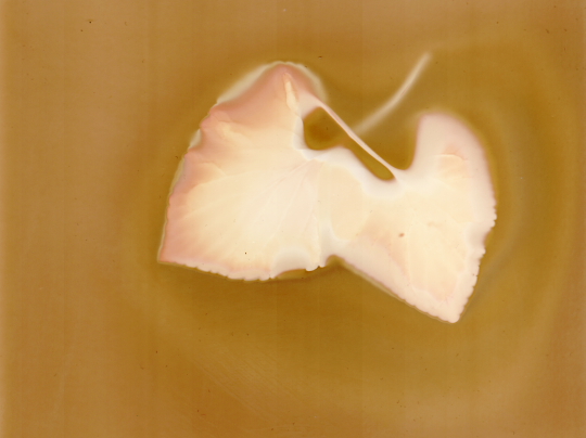
Print by Bryan
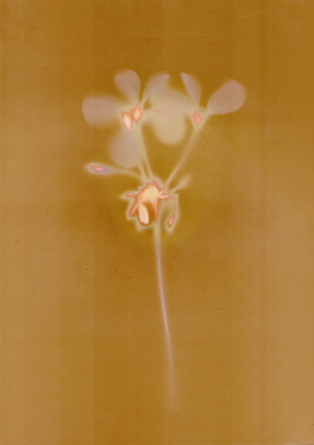
Print by Bryan
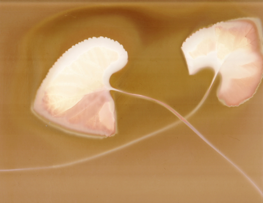
Print by Jamie
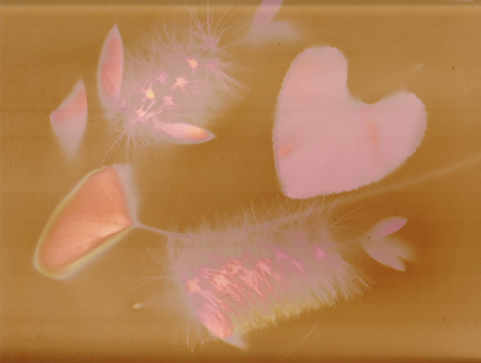
Print by Jamie
Photographics: Sabbatier
May 3, 2009
Sabbatier or solarization is an effect in printing in which the tones of the photograph are reversed. For our sabbatier project we were given the choice of either doing the print digitally or in the darkroom. For those of you who are not familiar with the wet darkroom I apologize if you get lost. To get a black & white sabbatier print in the darkroom you would expose a negative normally on photo paper using variable contrast filters. The first time you expose the paper you would only develop it in the developer solution for a short time, then put it in the stop bath and rinse it off. You would then squeegee off the excess water on the print and return it to the enlarger. However, this time you take the negative out of the enlarger and stop the enlarger lens down 1 stop and put the print under it for 1-2 seconds. Then you would just develop, stop, fix and rinse as normal. This process should produce a nice solarized print but depending on your taste you can vary up the exposures. Solarization is much simpler to do digitally, which is how Bryan and I chose to do it. We used GIMP to solarize our images. To solarize a color photo in GIMP you would first desaturate the image so it turns black & white, you then go into curves and change the diagonal line into a “U” shape. After this all you have to do is mess with the contrast a little and there you have it: Sabbatier. Below are our sabbatier images.
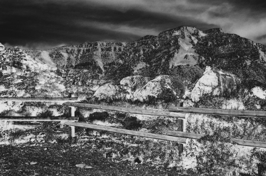
Photo by Jamie
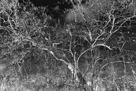
Photo by Jamie
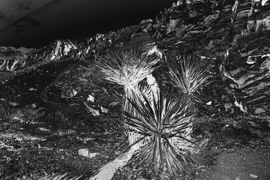
Photo by Bryan
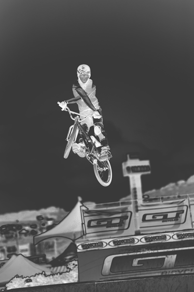
Photo by Bryan
Photographics: Infrared
April 23, 2009
One of the more interesting assignments we were given this semester was to turn in an infrared assignment. This could be be done in one of three ways; shoot a roll of infrared film, shoot infrared digitally with various filters or create a infrared image in Photoshop. We opted not to shoot a roll of infrared film for a couple of reasons. One reason is that Bryan’s Canon A2E will not shoot infrared (more on that later). My old Pentax camera did have the ability to shoot infrared film however if you know anything about IR film you know that it is very sensitive. You have to load the film in the camera in complete darkness. Doing anything in complete darkness is not a skill I have, except for loading film onto a spool for development. I also played around in GIMP trying to create a IR image out of a regular color image, while the results were passable they just weren’t infraredy enough. I know infraredy is not a word neither was ginormous a few years ago. We chose to do the assignment digitally however our Mark II doesn’t have the ability to shoot infrared. The majority of Canon SLR’s can not because of a low pass filter that Canon installs in their camera’s to get sharper images. Canon Film SLR camera use an infrared light to see the notches in the film so it would fog infrared film. During the class lecture on infrared Lanoue mentioned that the Canon G9 had the capability to shoot in IR. This was great since my coworker happened to have a G9 that he let us borrow. We had to by an infrared filter for it but that was much less than if we would have had to buy the G9.
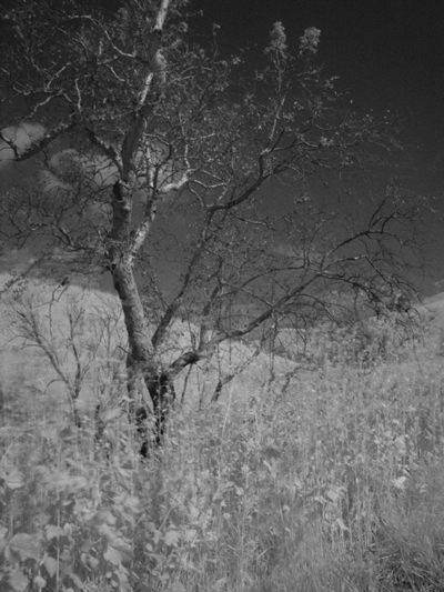
Photo by Jamie
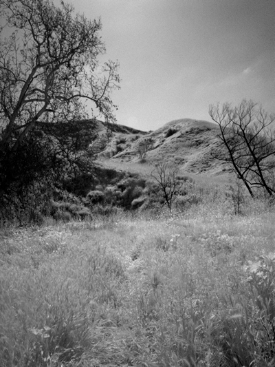
Photo by Bryan
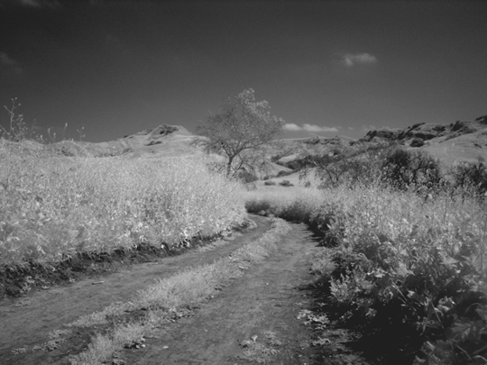
Photo by Jamie
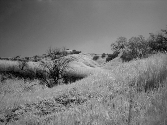
Photo by Bryan
Photographics: Applied Color
March 27, 2009
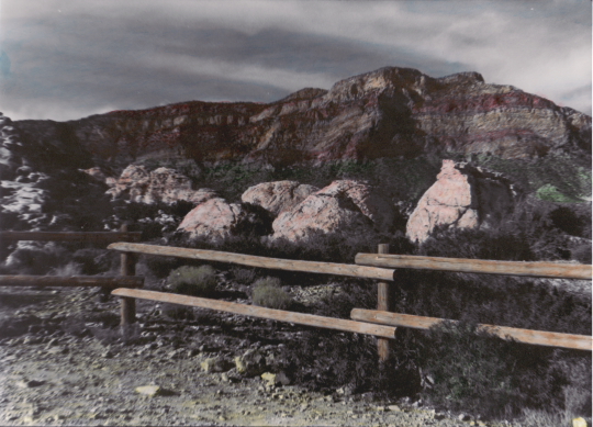
Red Rock Canyon by Jamie
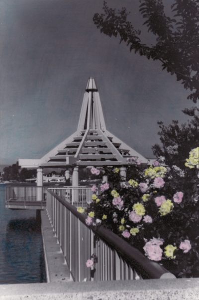
North Lake by Jamie
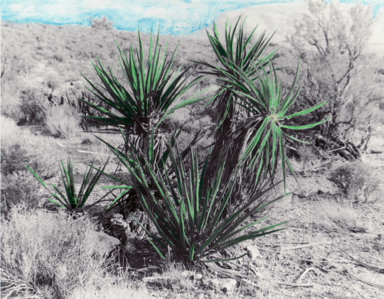
Desert by Bryan
Photographics: Toning
March 21, 2009
For our first assignment in our Photographics class we were required to do toning. There are many different kinds of toning and and many different ways to do toning. Our professor Michael Lanoue showed us how to do sepia toning, split toning and selenium toning both in the darkroom and in Photoshop.
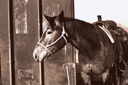
Digital sepia toning by Jamie
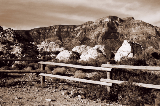
Digital sepia toning by Jamie
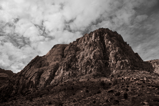
Digital selective toning by Bryan
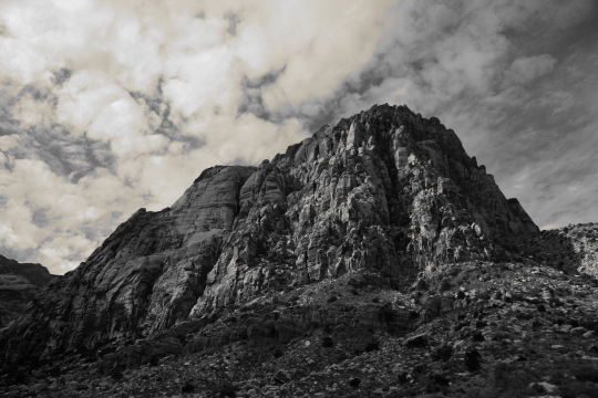
Digital split toning by Bryan
Zone Systems
December 15, 2008
Red Rock Canyon by Bryan
Last Thursday Bryan and I finished our last class of the Fall semester; Zone Systems. This class was taught by Greg Rager who is an expert in the old processes of photography. The zone system is not easily explained but I will make an attempt to make sense out of it. Basically it only applies to black & white photography. This class is completely film based and although Rager would have preferred having the class using medium format cameras that simply was not feasible so we used 35mm. There are eleven zones in black & white photography ranging from Zone 0 to Zone 10. It ranges from white to black, however there is no such thing as white and black it is only shades of gray. So basically it ranges from really light gray to really dark gray. Zone 5 represents 18% gray, which is what your camera meter reads…you following me so far? The purpose of zone systems is to eventually make a good print, but in order to make a good print you have to know how to make a good negative and of course in order to get a good negative you have to know how to expose for the different zones of detail when taking the photograph.
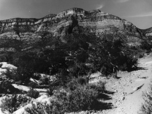
Red Rock Canyon by Jamie
The zone system works best on landscapes or any seen where there is not a lot of movement. It’s all about getting details in the shadows and also in the highlights. Rager recommends using a spot light meter when photographing because you can get readings for the different zones and try to find a happy medium. You should probably make sure your camera’s shutter and light meter are working before photographing as that can make a huge impact on your photo. Rager actually had some people do shutter speed testing on their cameras to see what actual speed their shutters were firing at. Some peoples cameras were way off. Unfortunately I didn’t get a chance to do this because I ran out of time, although I should have because my Pentax 35mm is ancient. Bryan didn’t have this problem as he has a newer A2E.
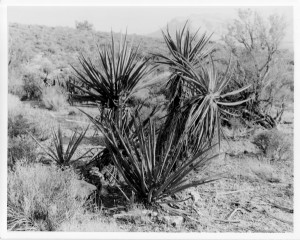
Red Rock Canyon by Bryan
After taking a whole roll of film we were expected to develop it ourselves and while most people did this we chose not to. There is a lot of work that goes into exposing a roll of film, like making sure your chemistry isn’t bad, the temp of the chemicals is not too hot or too cold and agitating properly. Now because Bryan and I work full time and have a very hard time staying up really late we decided to go the easy route and have our film developed at Pro Photo Connection. Rager was fine with us doing this however, he did have some concerns about how they might develop the film. Because there are so many factors that go into making a good print the developing process could easily be screwed up if someone at the lab doesn’t do something as simple as agitate for a long enough time. Many people in the class screwed up and had to develop multiple rolls of film. We just didn’t have that kind of time.
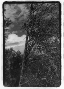
Irvine Regional Park by Jamie
A rule that Rager taught us was to expose for the shadows and develop for the highlights. You always want to make sure you capture the details in the shadows. You never want your negative to be too thin. A thin negative means you have not exposed enough and that will translate to a low contrast print. Likewise you never want your negative to be too dense. A dense negative means you overexposed and your print will be too light. If your negative isn’t at the extreme on either side of the spectrum it can be corrected in the printing process with dodging and/or burning. Dodging a negative simply means you are subtracting light when exposing the image to the photo paper. For example, if you have a print that needs 10 seconds of light exposure but a certain area is too thin and needs less exposure so you can get details in the shadows. You would simply set your timer for 10 seconds and let it expose the whole print for a few seconds and then cover up the thin area with some kind of apparatus for the rest of the time so it won’t get as much light. Burning is just the opposite, if you have an area that is too dense and needs more light you would then expose the whole print for whatever time is best for the normal areas of the print then cover those up and expose the dense areas to more light to get more details in the highlights. Does this sound like too much work? Well it is! That’s why it is so important to get the negative right in the camera. The better the negative is the easier it is to work with in the darkroom. In one instance Bryan went through a whole pack of photo paper and spent 4 hours to get one good print.
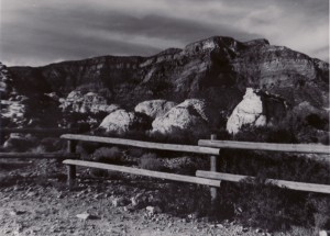
Red Rock Canyon by Jamie
At the end of the class we had to present a portfolio of six prints to the class. You would think six prints sounds like a small amount for a portfolio until you realize how time consuming and frustrating it is to get one good print. I definitely learned a lot from this class but I think that the difficulty of the class requires more time then just 16 weeks. It took a long time for people in the class to get good negatives, it seemed like there was more experimentation in the dark room than actually shooting the film. I heard that the college is thinking about turning the class into a four part series and that probably is a better idea because there is no way you can learn everything about the zone system in one course, no matter how good the instructor is. I have to give credit to Rager though, he was very patient with us, even when we asked the same questions over and over and over again. I’m sure he’s used to the confusion.


