Photo 191: Truth Is Stranger Than Fiction with CS5 Tutorial
May 23, 2010
Jamie and I have been pushed to do more creative work in our latest class then any of the previous classes we have taken. The most recent example being our “Truth is Stranger than Fiction” assignment. We each had creative blocks for a fairly long time before we came up with the ideas for our individual projects. Once we each decided on what to do the next challenge was taking the photos and editing them in the amount of time left. I personally was limited in that I didn’t have access to a pickup truck and so I relied heavily on the abilities of Photoshop for post production work. In the paragraphs to follow I will take you through the steps I took to make just one of my images. I will also tell you what I would have done (and may still do) to correct some of the less successful images.
The Premise:
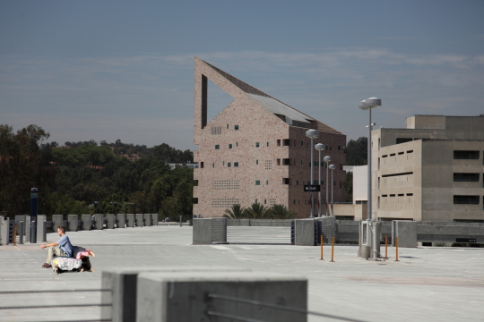
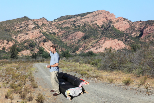
My idea for the project was to take photos of myself on a couch that I am in the process of disassembling in my garage in various locations where you would not expect to find a couch. In addition I would be staring off into something out of the frame and have a gaming controller in my hands and a headset on. Seeing as I was crunched for time and didn’t have a truck I decided to take the background shots separately from the subject shots of me on the couch and then merge the two into a composite image in post production. This proved to be a difficult task as you can imagine.
The Execution:
The first step was for me to take the photos for the background settings. I wanted to choose settings where it would be strange for a couch to be sitting in the foreground. In addition I needed photos which had an empty space for me to place the subject. I took two such shots and then went into my massive library of images to find the other four. Fortunately I had many images with empty ground in the foreground. Why I have these photos, I don’t know but it worked out. Next I needed to take the shots of the subjects.
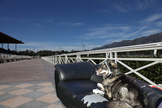
I dragged my old couch out of the garage and set up the shots. I put it in direct sun but didn’t worry about the background. I set up the shots but I had Jamie help with actually pressing the shutter while I posed. How the shots were composed did not matter as much as getting the couch in the frame. Once we got the shots of myself I posed the dog and stood behind him while holding his leash. The next step was post-production where all the magic happens.
Post-Production:
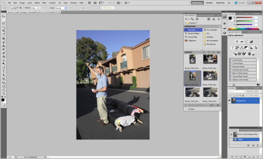
The first step was to mask just the subject out of the photo so it could be placed in the background shot. I started this in Photoshop CS4 trial and during the process the trial ran out. I purchased Photoshop CS5 Extended and downloaded the trial to get me through the time between when I ordered it and when it arrived. This was actually good because the “quick selection” tool and “refine edge” dialog box became even better in CS5.
Something you can see in the photo is the new “Mini Bridge” which lets you browse as you would in Bridge except within Photoshop. One note is that if Bridge is not already running then it will need to start in order to show “Mini Bridge”.
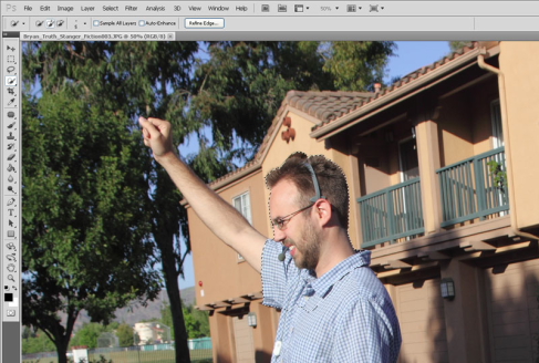
I used the quick selection tool to select the subject. There are a few tricks to using this tool successfully. The first is to understand the two means of controlling how much it selects. These means are: 1) reduce or enlarge the brush size and 2) zoom in and move the tool more slowly. Another tip is to remember that it is called “Quick Selection” for a reason. There are times when you need to fix things with the lasso tool or other times when the magic wand works better. You should remember though that by default the quick select tool adds to your selection but you can just as easily use it to remove from your selection.
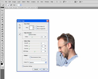
The next step I took was “Refine Edge”. You can access this by going to Select–> Refine edge or by clicking the “Refine Edge” button which is visible when using the quick selection tool. You can use this tool to expand the area of edge detection, smooth the edges of a selection, feather the transition of the selection edge, or adjust the contrast of the selection edge. The most useful part of this tool for me is the ability to expand the radius of edge detection as it is a really easy way to get a good selection of hair, fur or other uneven edges.
There are a few new options in this dialog box in the CS5 version. These include the “Smart Radius” check box, the ability to paint to expand the refine edge radius in certain areas, and the “Decontaminate Color” check box and slider. The “Smart Radius” check box will contract the maximum radius of the edge detection in areas where it does not need to be so large. If you need more control, you can now paint in to add to or remove areas of edge refinement. Lastly, “Decontaminate Color” will actually change the color of pixels to get rid of background color seeping through or light from a nearby object which reflected onto the edge of your selection. If you use this option then you are forced to output to a new layer as some of the original image information is destroyed/changed.
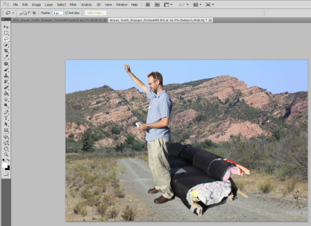
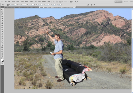
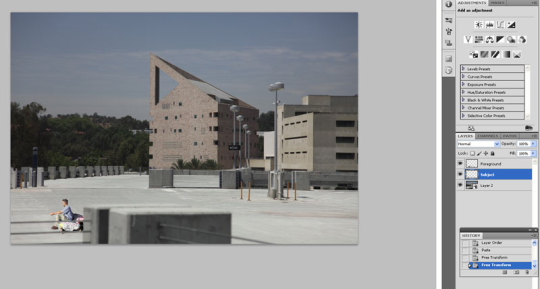
Once I completed masking out the subject (myself and the couch) I simply copied the image information and pasted it into the background of the new image as a new layer. This results in the object in the new layer being much too large in this context. In order to re-size the subject you can go to edit–> Transform–> Scale. Then hold shift as you change the size of the object. Holding shift maintains the aspect ratio as your re-size. You can also drag the object around while in this mode.
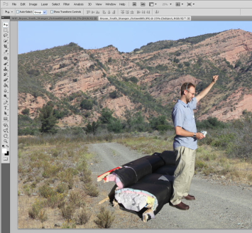
For this image this completed everything I did. Now the success of the image at this point depends on the quality of your selection as well as the way the lighting on each image matches or contrasts with each other. For instance this is how my image would look if I flipped the subject horizontally. You can do that from Edit–>Transform–>Flip Horizontally. Now the shadows are heading in the same direction, however I didn’t like this as much compositionally so I left it.
Depth of Field, Lighting, Shadows, and other challenges:
Some things which I needed to take into account in the project included lighting, shadows and depth of field. In this image I applied a blur to the subject because if it was completely sharp it would not make sense. This landscape shot had a focus point approximately at the hyper focal distance. This means things in the foreground have various levels of being out of focus. Still even with this applied this image appears just slightly unbelievable. To add to the realism I made a selection of just the foreground and pasted it in place on a new layer on top of the subject layer. Then I moved the subject so that it was sitting behind the foreground.
I realize that in order to fix all my shots I should have shot it in such a way as to eliminate shadows completely. Then the images where there was a shadow could be manipulated to reduce the contrast and exposure of the subject to match the background. Oh well, next time.
The final step that I could have taken to blend my images more convincingly would be to apply adjustments to the whole image. Here is what it would look like converted to Black and White with noise added.
What does it mean?
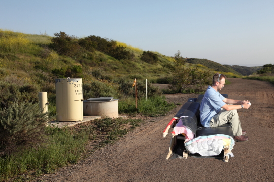
You might ask what does my project mean or what is it trying to convey. I guess it’s trying to convey that games transport you places. It could also be said to convey that people get sucked into gaming so deeply that they forget what is going on around them.
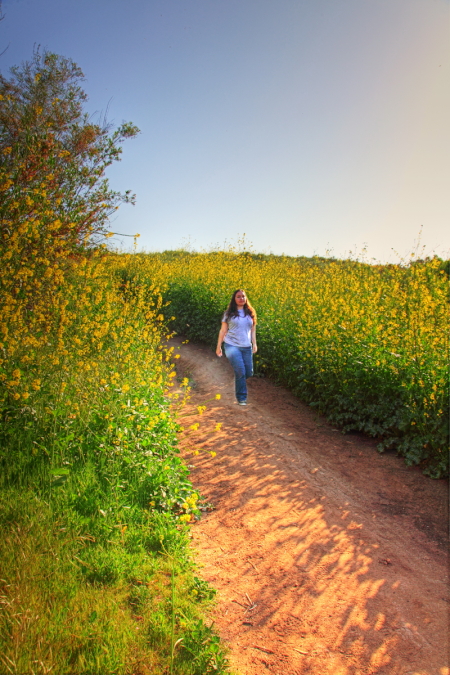
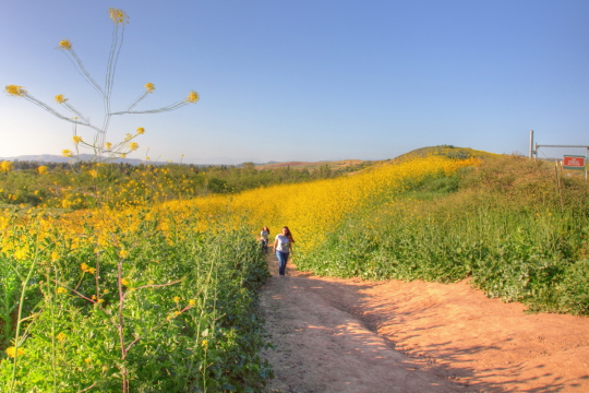
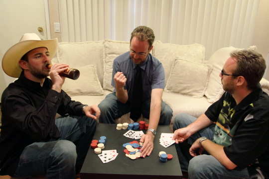
Jamie did the same project with a little bit different approach. She took multiple shots from the same angle and merged them together and then used layer masks to bring out the different locations of the subject. She also combined multiple images of the background at different exposures to create HDR (High Dynamic Range). Below is my completed project followed by hers.
Jamie’s Project
Photo 191-Photomerge
April 18, 2010
Photo 191: Portraits
April 6, 2010
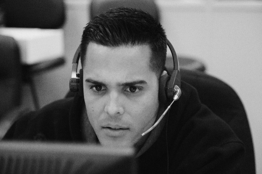
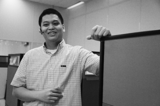
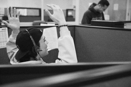
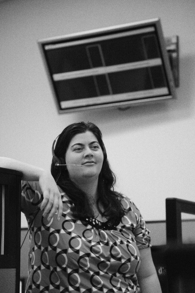
For our second project in our digital photography class we were asked to do portraits. I chose to do environmental portraits of my coworkers. To make my photos a little more artsy I converted them to black & white and added noise in Photoshop to make them have a more grainy film feel. I think they were very successful. I call my series; “Life in Customer Service”.
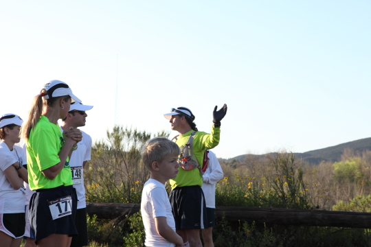
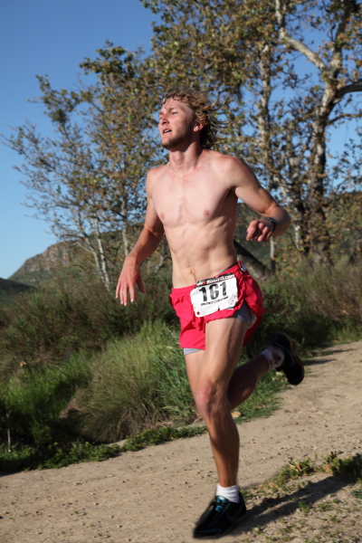
Bryan did his own environmental portraits while at the Dirt Devil Race. He shot his photos when the sun was coming up over Mission Trails so he got very beautiful golden light.
Photo 191: Point of View
March 15, 2010
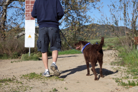
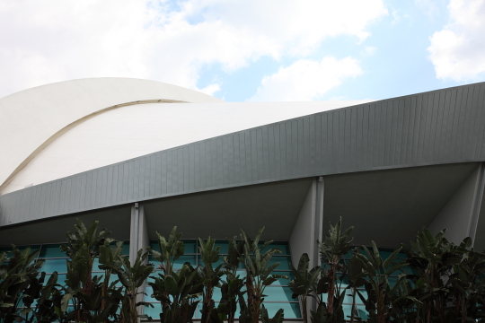
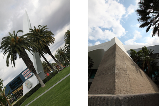
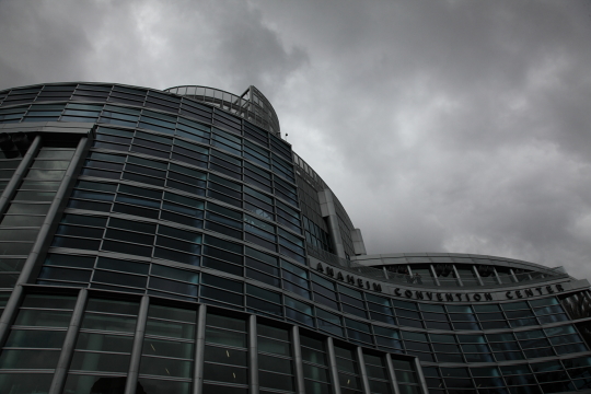
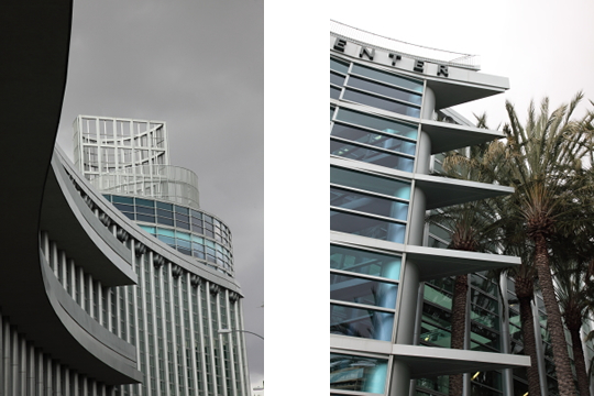
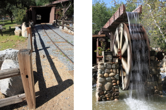
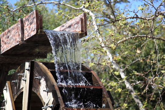
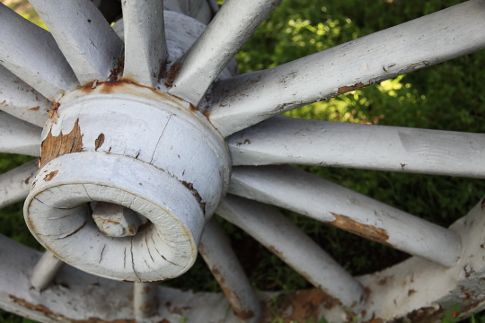
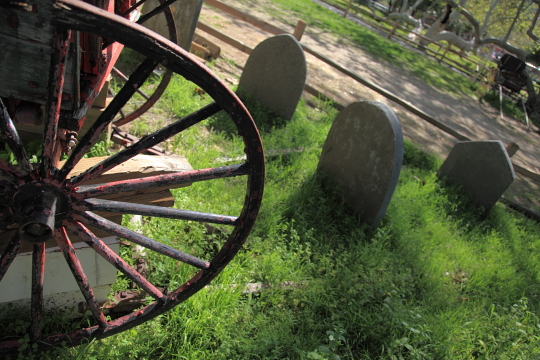
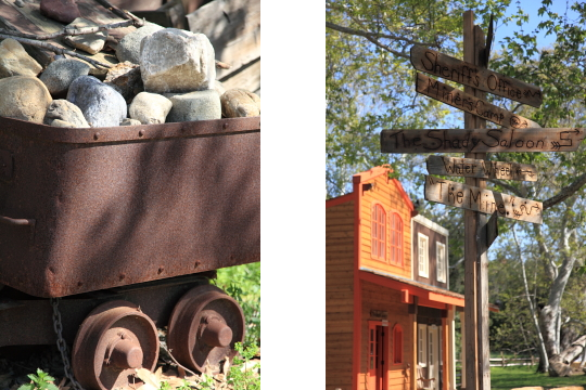
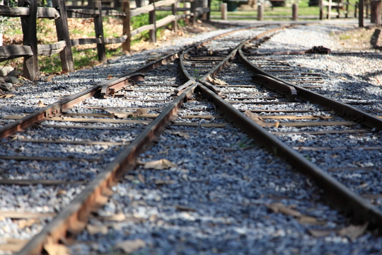
Recently Bryan and I enrolled in a digital photography class at Santa Ana College. Although we are both very savvy in digital photography we decided to take the course to brush up on our Photoshop skills since we don’t have very much experience in that area. The first project we were given was called point of view. Our instructor, Neil Sharum, required us to pick a subject or a theme and shoot it from a different point of view. The rules were to find a different perspective to shoot from, he explicitly stated that we could not shoot at eye level. Both of our projects were well received by our fellow students.
Bryan chose and architectural theme for his project. We went down to the Anaheim Convention Center to get his shots.
I chose Irvine Regional Park to shoot my project. I consider my theme to be “Rural America”.
Photographics: Final Portfolio
June 12, 2009
Our final project for Photographics required us to put together a portfolio of images that we created in the class. The portfolio was to be 8-14 images, mounted with some kind of theme or uniformity to them. Some students chose a flower theme, some did all lumen prints, some did a variety of different tones. I was really impressed with the quality of work from our fellow classmates. Some of them are masters in the darkroom and many have a great eye for composition, most of them blew my portfolio away, they were just so good. Bryan chose to use his best images that he had turned in throughout the semester for his portfolio. I decided to do a batch of fresh images. I took two older film photos and reworked them digitally. For each photo I did a sepia toned image, a sabbatier, an applied color, a high contrast and a lith. The professor and my fellow students liked the idea and thought it was interesting to see a variation on one image side by side. Below is my portfolio.
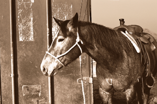
Sepia by Jamie
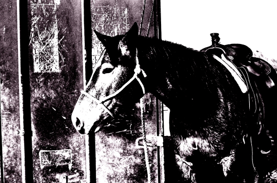
High Contrast by Jamie
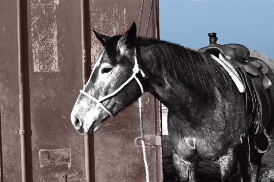
Applied Color by Jamie
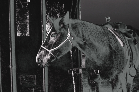
Sabbatier by Jamie
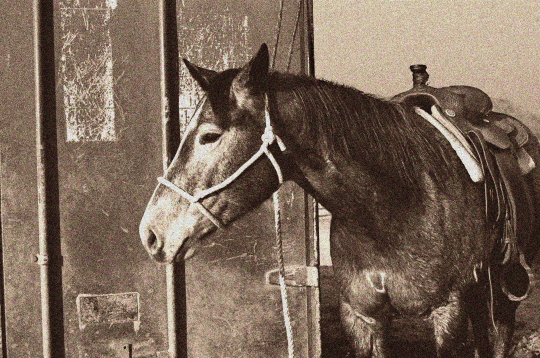
Lith by Jamie
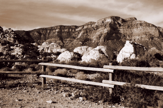
Sepia by Jamie
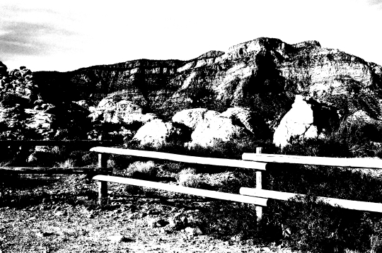
High Contrast by Jamie
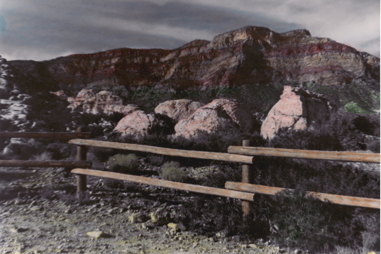
Applied Color by Jamie
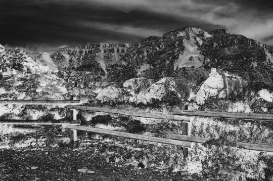
Sabbatier by Jamie
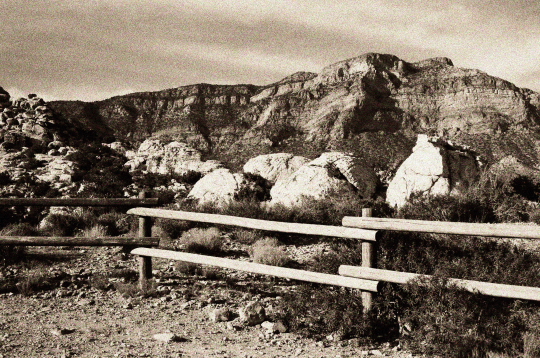
Lith by Jamie
Photographics: Lith
June 4, 2009
Our last assignment for our class was to do a lith print. Lith printing done in the traditional wet darkroom requires the use of a special developer to produce a print that looks grainy. I don’t quite understand the point of lith printing but the results do have a nice look to them. For our lith prints we once again chose to do them digitally. We first desaturated and sepia toned the images in Digital Photo Professional and than added noise to them in GIMP. We also adjusted the highlights/contrast to get a more lithy look. I really liked the final results of our photo manipulation, it makes them look like old photographs.
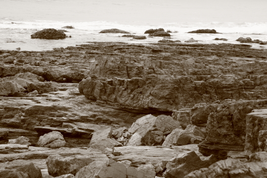
Photo by Bryan
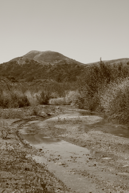
Photo by Bryan
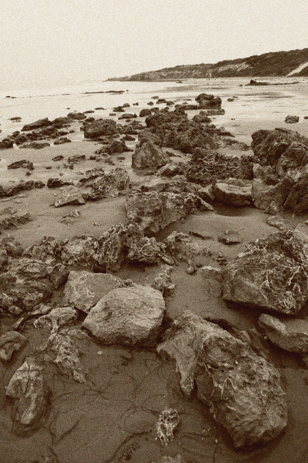
Photo by Jamie
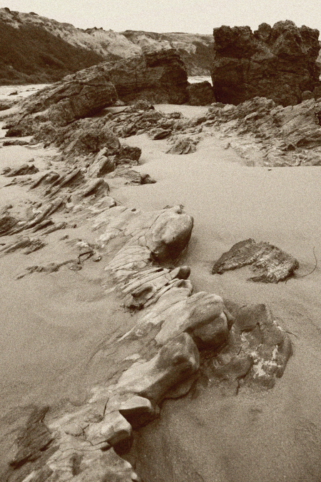
Photo by Jamie


